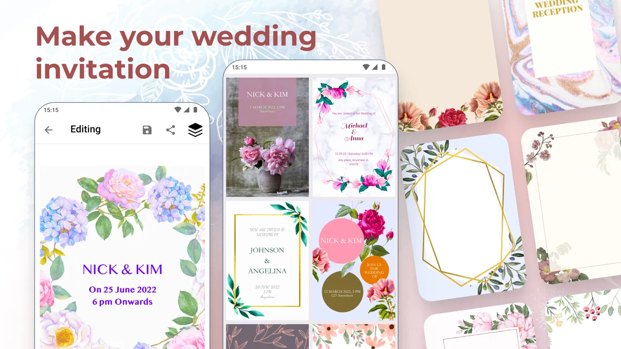
Wedding Invitation Card Maker
- 4.5
- Rating
- 1.00M
- Installs
- Free
- Price

 Analysis by App-foxy
Planning a wedding often starts with a surprisingly small decision: how to tell people when and where it will happen. Wedding Invitation Card Maker is built for that moment, offering a focused way to create wedding cards on a phone instead of starting with a blank design program or settling for a plain text message. I found it most useful when I wanted to move quickly from an idea to something presentable without learning a complicated editing system.
This is an Events app from DOSA Apps, available for free and suitable for Everyone. Its store presence is substantial, with over a million installs and an average rating of 4.5 from around thirteen thousand ratings. Those figures do not automatically make it the right choice for every couple, but they do suggest that the basic invitation-making workflow has connected with a broad audience.
What I looked for before recommending it
When I judge a wedding invitation tool, I care less about how impressive the opening screen looks and more about whether it helps me finish a usable invitation. The important questions are practical: Can I create something that matches the mood of the wedding? Can I edit the wording without fighting the layout? Will the result feel personal rather than copied? And can I share it with guests without turning the process into another project?
You May Also Like

 Blood Strike: 2.5 Anniversary
Blood Strike’s Loadouts Turn Every Drop Into a Tactical Gamble
A close look at Blood Strike’s custom loadouts: how fast access to signature weapons reshapes its battle royale rhythm, rewards preparation, and narrows the gap between fights.

 Pandora - Music & Podcasts
Pandora’s Music Is Easy to Start, but Harder to Recover
Pandora’s strength is its low-effort path from a seed to a station. Its weak spot is how much confidence it asks you to place in connection, setup, and quiet recovery.

 8 Ball Pool
 Is Built on Rivalries, Rematches, and Routine
A close look at the rivalries, rematches, shared routines, and unanswered safety questions that turn a quick pool match into a persistent mobile community.

 Samsung Music
’s Quiet Strength Is Playing What You Already Own
Its reach comes less from spectacle than from dependable access to a personal library. That simplicity is both the app’s strongest retention engine and its ceiling.

 AccuWeather: Weather Radar
AccuWeather Review: A Quick, Clear Forecast for Everyday Decisions
For everyday plans, the best forecast is the one you can understand quickly. AccuWeather makes rain timing, radar, and local conditions easy to act on, with a few trade-offs.

 Hill Climb Racing
Why Hill Climb Racing Still Turns Crashes Into One More Run
A tiny car, a bumpy hill and one more upgrade: Hill Climb Racing keeps resurfacing because its simple chaos makes every near-miss feel personal.
More From Our News Desk



I also pay attention to the kind of user the app is serving. Someone arranging a small family ceremony may want a warm digital card finished during a lunch break. Someone planning a formal event may care more about exact typography, print preparation, and control over every visual element. Those are different needs, and a mobile card maker should be judged by how well it handles its intended level of design rather than by standards meant for professional desktop software.
On my phone, the main appeal was the narrow purpose. I was not presented with a general design studio full of unrelated posters, social graphics, and business templates. The experience is centered on wedding invitations, which makes the starting point easier for a user who already knows the occasion but does not necessarily know how to design for it.
A realistic use case: the guest-list change
Imagine that a couple has chosen a venue, confirmed the ceremony time, and sent a few early messages to relatives. Then the wording changes: the reception address is updated, a parent’s name needs to be added, or the couple decides to include a short note about the dress code. This is where a phone-based invitation maker can be more convenient than ordering printed cards. I could make the change in the same place where I first created the card instead of discarding a batch or asking someone else to rebuild the design.
That flexibility is especially helpful when the guest list is spread across different circles. A couple might want one version for close family, another with a shorter message for colleagues, or a separate card for people invited only to the reception. The sensible workflow is to create one carefully checked base design, duplicate the wording mentally or manually as needed, and review every version before sending. The app can make the creation step easier, but it cannot prevent a user from forwarding the wrong time or address.
Where the focused approach works well
The strongest part of the experience is the reduction in creative friction. A blank canvas can be intimidating because every choice is yours at once: colors, spacing, hierarchy, wording, and decoration. A wedding-specific tool gives the task a clearer frame. I could think about the invitation itself instead of first learning how to build a design system.
That makes it a good fit for couples who want a polished digital announcement but do not describe themselves as designers. It is also useful for a friend or family member helping with the wedding. If one person is responsible for preparing the card while another supplies the final details, a focused app is easier to hand over than a complex professional editor.
Another advantage is speed. The app is free to install, so it is easy to try before committing to a particular workflow. I would begin by drafting the complete text outside the design itself, including names, date, time, venue, directions, RSVP wording, and any note guests genuinely need. Then I would place that final copy into the card. This simple preparation step reduces the most common invitation problem: spending time on decoration before discovering that the essential information no longer fits comfortably.
The best result comes from treating the card as an information tool first and a decoration second. A beautiful invitation that makes guests search for the location or wonder whether children are included is still a poor invitation. I found that keeping the wording short and separating the ceremony details from optional personal text made the design easier to read.
Personalization without losing clarity
Wedding stationery is emotional, so a completely generic result can feel disappointing. At the same time, adding too many flourishes can make a card look crowded on a small phone screen. My advice is to personalize the message, not every available visual area. Use the couple’s names prominently, add one sentence that sounds like them, and keep the practical details visually distinct.
This is also where previewing matters. A line that looks balanced while editing may become awkward when the full invitation is viewed at once. I would check the card at normal phone size, not only zoomed in. I would also ask someone who was not involved in the design to read it. Fresh eyes are more likely to notice a missing apartment number, an ambiguous date format, or a phrase that sounds clear to the couple but not to guests.
For a bilingual guest list, I would be cautious about squeezing two complete languages into one small card. A shorter bilingual version may work for essential details, but a separate card or message can be clearer when the wording is substantial. This is not a weakness unique to this app; it is a design trade-off created by the limited space of a digital invitation.
What the free starting point means
The app is free, which lowers the risk of testing it with a real invitation. There are also in-app purchases ranging from under a dollar to amounts approaching one hundred dollars per item. I would therefore avoid assuming that every design choice or final-use option is included at no cost. Before building the entire invitation around one particular style, I would check whether the elements I want are available within the free experience.
This is an important cost habit with any template-based creative app: decide the acceptable budget before becoming attached to a design. If a paid item is necessary for the look you want, compare that expense with the value of convenience. For a simple digital card, paying may not be worthwhile. For a time-sensitive wedding announcement where a particular visual style saves hours, it may be reasonable. The right answer depends on how much control and speed matter to you.
How it compares with the usual alternatives
The most obvious alternative is a general-purpose design app. Those tools usually make sense when you want to create many different materials, such as menus, signage, social posts, and thank-you cards, using one broad workspace. They may be the better choice for a couple who already understands layers, typography, alignment, and export settings. The trade-off is that the wider range of tools can slow down someone who only needs one wedding card.
Another alternative is a printed invitation service. Printed stationery has a physical quality that a phone image cannot reproduce, and it can suit formal weddings where paper, envelope, and tactile presentation are part of the experience. The downside is the cost of ordering, the time required for delivery, and the inconvenience of correcting a mistake after printing. A digital card maker is more attractive when plans are changing or when guests are comfortable receiving invitations electronically.
There is also the simplest option: a personal message with the details typed directly into a chat app. That approach is fast and practical, especially for a small gathering. It is less effective when the couple wants one consistent visual announcement or hopes guests will keep the invitation for reference. This app occupies the middle ground: more expressive than plain text, but less demanding than a full stationery project.
I would not choose it as my first option for a highly controlled print campaign. If the invitation must meet exact production requirements, include elaborate illustrations, or be edited by several people with a formal approval process, a dedicated professional design workflow may be safer. The app’s value is convenience and focus, not replacing every kind of design software.
Small workflow choices that make a big difference
My first practical tip is to create a checklist before opening the editor. Write down the exact spelling of both names, the preferred date format, the full venue name, the address, start times, RSVP contact, and any wording about the ceremony or reception. This prevents the familiar mistake of designing around incomplete information and then forcing too much text into the card later.
My second tip is to make the invitation readable for the least technical guest. Avoid relying on color alone to separate important details, and do not assume everyone will understand an abbreviated location. If the card is being sent digitally, include the key information in the accompanying message as well. That gives guests a searchable text version while preserving the visual charm of the card.
My third tip is to use a staged review. First check factual details, then check readability, and only after that judge the style. Couples often proofread the names repeatedly while overlooking the time, because the visual design attracts attention. A short pause between revisions also helps; reading the same card immediately after editing makes familiar mistakes harder to see.
A fourth useful habit is to keep an original version before making special variations. If one card is adapted for different guest groups, preserve the clean base wording. Otherwise, a later correction can become confusing, especially when several versions look almost identical. This is a simple form of version control that matters even in a small wedding project.
Who should use it, and who should skip it?
I would recommend it to couples who want a wedding-specific starting point, prefer working from a phone, and need an invitation that can be prepared without becoming a separate design course. It is also a sensible option for informal ceremonies, engagement celebrations connected to the wedding, reception-only announcements, and last-minute updates where printed stationery would create unnecessary pressure.
It is less suitable for someone who wants complete control over every typographic measurement or expects a single tool to manage an entire printed wedding suite. If you already work comfortably in a general design editor, the focused nature of this app may feel restrictive rather than helpful. Likewise, if your guests need a formal paper invitation, this should be considered a digital design aid rather than a replacement for the whole stationery process.
Device compatibility is another practical point. The app requires Android 6.0 or later, and the current version is 13.1.4. Before planning around it, I would check the phone that will actually be used to create the invitation rather than assuming an older spare device will handle it. That is a small step, but it prevents a frustrating interruption close to the sending date.
My recommendation
After using it as a wedding invitation tool, I see Wedding Invitation Card Maker as a convenient middle option: more thoughtful than sending raw text, quicker than building a design from scratch, and easier to approach than professional software. Its free entry point makes experimentation sensible, while the possible in-app purchases mean I would review the cost of any preferred design element before investing time in it.
I would choose it for a couple who values speed, a wedding-focused workflow, and a card that feels more personal than a group message. I would skip it in favor of a broader design tool or a print specialist when exact production control, extensive customization, or physical stationery is the priority.
The app is rated for Everyone, and its popularity among more than a million installers gives it a credible place in the Events category. Still, the final decision should come from your guest list and wedding style, not from popularity alone. If your goal is to create a clear, attractive digital invitation on a phone and share it without unnecessary complexity, this is an app I would comfortably suggest to a friend.
FAQs for Wedding Invitation Card Maker
01What features does the Wedding Invitation Card Maker offer?
The Wedding Invitation Card Maker app provides a wide range of features, including customizable templates, various font styles, color palettes, and decorative elements like stickers and borders. Users can also add personal photos and text to create unique, personalized invitations. The app supports high-quality downloads for both digital sharing and printing.
02Is the app user-friendly for beginners?
Yes, the Wedding Invitation Card Maker is designed with an intuitive interface, making it easy for beginners to navigate. The app includes step-by-step guides and tutorials to help users create invitations without needing any prior design experience. Its drag-and-drop functionality further simplifies the design process.
03Can I share my invitations directly through the app?
Absolutely. The app allows you to share your invitations directly via email, social media platforms, or messaging apps. You can also save your designs in various formats for printing or digital distribution. This makes it convenient to reach your guests with just a few taps.
04Does the Wedding Invitation Card Maker offer support for multiple languages?
Yes, the app supports a variety of languages, making it accessible to a global audience. Users can create invitations in their preferred language, ensuring that all text and details are accurately presented. Language options can typically be adjusted in the app settings.
05Are there any costs associated with using the app?
The app is free to download, offering a selection of basic templates and features at no cost. However, premium features, such as exclusive templates and advanced customization options, may require an in-app purchase or subscription. Users can choose to upgrade for a more extensive design experience.
Pros
- User-friendly interface for easy design.
- Wide variety of templates available.
- Customizable fonts and colors.
- Supports high-quality image exports.
- No internet needed after download.
Cons
- Limited free features; in-app purchases.
- Occasional ads interrupt workflow.
- Some templates feel outdated.
- Exported files can be large.
- Lacks direct social media sharing.

Wedding Invitation Card Maker
Gallery